All NBA team logos have their own backstory. Logo designs can highlight a city, connect with a team name or evolve from ABA lineage.
Some team logos stay constant throughout the history of a franchise. See the Chicago Bulls. Other logos change because of a team’s relocation. So long, Minneapolis Lakers. Hello, Los Angeles Lakers. And some logos change for no logical reason at all.
Whatever the history, every NBA logo has a story to tell. These are those stories.
Atlanta Hawks
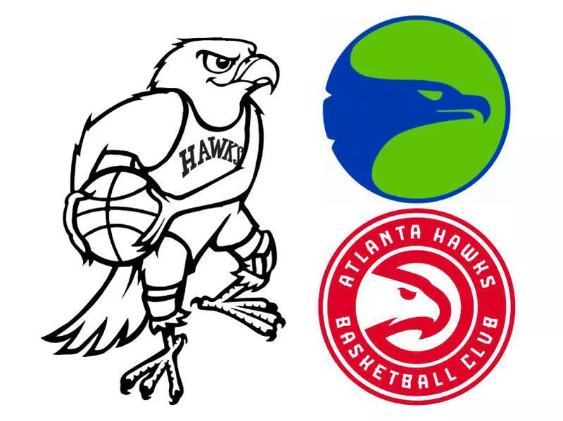
The Atlanta Hawks weren’t always the Atlanta Hawks. They started as the Buffalo Bisons in 1946 in New York.
Then, they moved to Moline, Ill., and became the Tri-Cities Blackhawks. Their logo was a light blue basketball with the names of the three cities the team represented: Moline, Rock Island, Ill., and Davenport, Iowa.
From there, the franchise moved to Milwaukee in 1951. The team shortened the name to “Hawks” and changed the logo to a white hawk, outlined in red, carrying a basketball with the basket underneath and the “Milwaukee Hawks” in a parabolic shape.
The Hawks moved to St. Louis in 1955 and went with a black hawk carrying a white basketball by its beak. In 1957, the team changed its logo to a Hawk in a triple-threat position, wearing a white Hawks jersey and kneepads, with the team name spelled out in black letters.
When the Hawks moved to Atlanta in 1968, they kept the same logo, except for a few small changes. They outlined the Hawk in black and got rid of the “St. Louis Hawks” name underneath the Hawk posing with the ball.
In 1970, the logo was transformed to a red Hawk in a Hawks jersey with kneepads dribbling a basketball. They kept that logo for a year until they changed it again to a hawk in blue facing to the right. It is encircled by a lime green background, with a blue outline that continues from the hawk in blue.
In 1972, the team changed the logo to an almost “reverse Pacman” with “Atlanta Hawks” transcribed in red at the bottom of the logo and the outline of a Hawk serving as the “mouth” of the “reverse Pacman.”
From 1996-2007, a new Hawks logo was featured with a Hawk in red spreading out its wings, while its claws grasp onto a basketball. “ATLANTA HAWKS” is spread at the top of the logo.
In 2008, the logo went through some minor changes, replacing a yellow outline with navy blue.
The current Hawks logo is just like the “reverse Pacman” one used from 1972 to 1995, but encircled in red is “Atlanta Hawks Basketball Club” in white typography, along with another white circle, then red, to complete the logo.
Boston Celtics
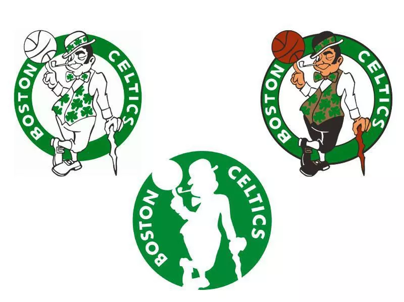
The first Boston Celtics logo, from 1947 to 1950, was a white shamrock inside of a green circle background with “Celtics” white lettering at the top.
In 1951, the logo was changed to a leprechaun wearing a crown in white, jumping while holding a cane.
A new version of the leprechaun logo in 1961 featured an orange background in the logo.
Then, in 1969, the leprechaun logo was redesigned with the leprechaun wearing a green Irish hat, with a basketball on his pointer finger and cane in his left hand. There is a reddish-brown basketball as the background, as well as “Boston Celtics” in white letters on one side of each other.
The updated version of the leprechaun logo from 1977 to 1996 is a green-colored leprechaun, with a green ring around the leprechaun and the typography “Boston Celtics” in white.
The current logo of the Celtics has slight color changes, including the skin tone of the leprechaun. The cane and basketball also are brown, his vest and stripe across his hat are gold, the green circle is a darker green, and there is a black outline around the dark green circle that says “Boston Celtics in white.
Brooklyn Nets
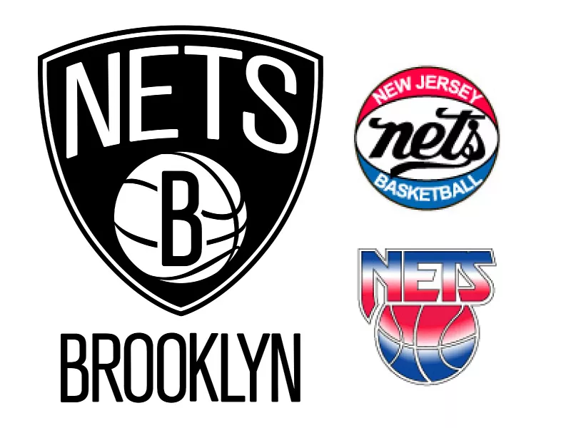
Wikipedia / NBA
In 1967, the New Jersey Americans logo is a red, white and blue shield, with a red, white and blue basketball in the center and “N.J. Americans” spread across the top of the shield. There are three white stars on each side of the shield.
In 1968, the team moved to Long Island, N.Y., becoming the “New York Nets.” They replaced the American shield with a large “NY” in red letters and “nets” in a blue cursive wordmark with a basketball player playing in the color black.
In 1973, there were some slight changes to the logo as the generic player was dropped and in the “NY nets” was a red, white and blue basketball.
In 1977, the team moved to New Jersey and followed a similar logo to the last New York Nets logo with a red, white and blue basketball. On the top portion of the logo in white lettering, it says “New Jersey.” The “nets” typography is enhanced and darkened, with “Basketball” appearing on the bottom blue portion of the basketball in white letters.
The team completely redesigned its logo in 1979 as they still had a red, white and blue theme, but incorporated the state of New Jersey in it in white, with “New Jersey” right next to it. “Nets” appeared in a white wordmark near the bottom of the logo.
Then, in 1997, the team changed its logo to a red, white and blue gradient with “Nets” at the top of a gradient basketball.
From 1998-2012, the team’s logo returned to the shield design from the first logo with a ring around the shield. Inside the shield, a silver basketball was featured. The color scheme changed as the red got darker, navy blue was the change of blue, and the team added silver and gray.
The team moved to Brooklyn in 2012, changing the logo to a white basketball with a black “B” on it and in the black circle contained the lettering “Brooklyn New York” in white.
The current logo slightly changed by going back to the shield concept with “Nets” on top of the inside of the shield and the white basketball with the black “B” on it. “Brooklyn” lettering is underneath the shield.
Charlotte Hornets
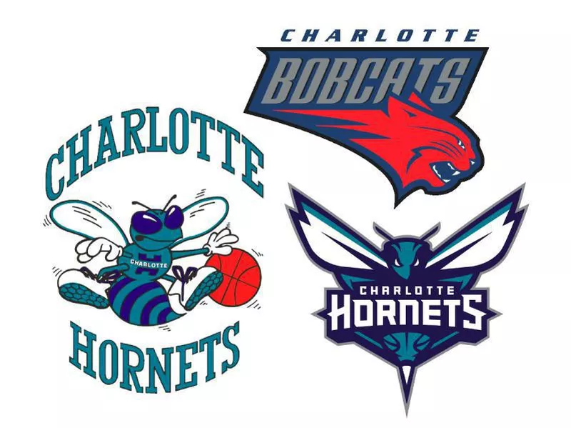
The original Hornets franchise was founded in 1988 as an expansion team and unveiled the logo of a teal colored hornet dribbling a basketball with a lighter wordmark “CHARLOTTE” on top of the hornet with “HORNETS” at the bottom.
In 2004, Charlotte became the Bobcats with the inaugural logo being a roaring dark orange bobcat with “BOBCATS” above it and the wordmark “Charlotte” on top.
In 2008, the orange bobcat became a lighter orange while the other parts of the logo did not change.
There was a slight color iteration in 2012 when the bobcat color was turned to gray and the “BOBCATS” lettering is in white and the “CHARLOTTE” wordmark is in orange and inside the logo.
In 2014, the Charlotte Bobcats went back to being the Hornets like in the past. The logo has a fierce looking hornet with its white eyes tilted downward in a menacing stare. The raised wings and antennae suggest a fierceness and intensity. Within the logo is a basketball as part of the body, and the stinger is attached to the basketball. The lettering, “CHARLOTTE HORNETS” is in white across the logo.
Chicago Bulls
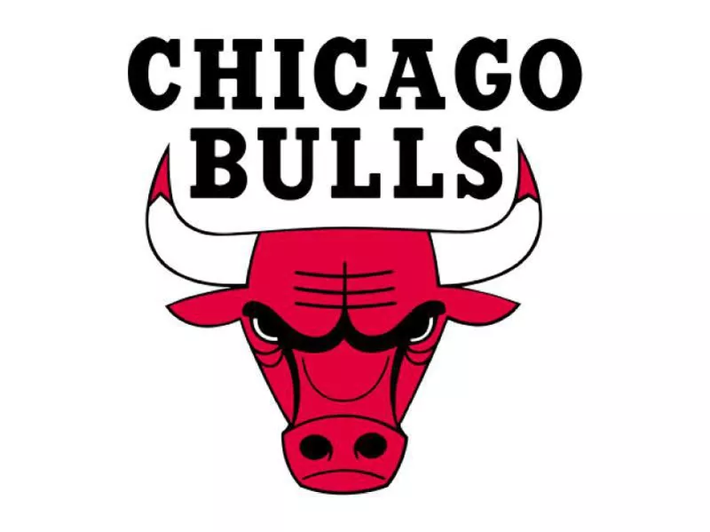
NBA
From 1966 to the Michael Jordan era to the present day, the Chicago Bulls have kept the same logo.
It contains a dark black wordmark “CHICAGO BULLS” on top of a red bull, who looks raging and has blood on the tips of its horns.
Cleveland Cavaliers
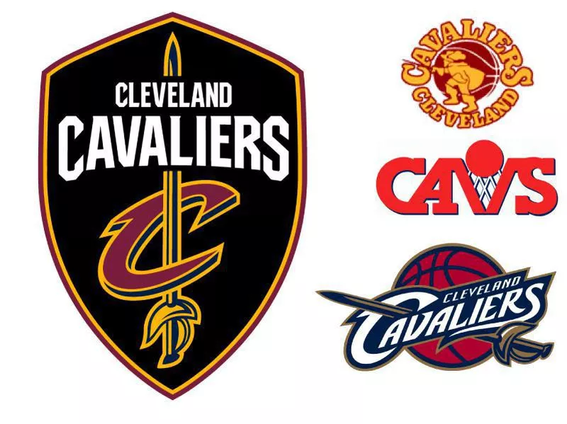
The first Cavaliers logo in 1970 features a swashbuckling cavalier in red with “CAVALIERS” on the top and “CLEVELAND” on the bottom. There is a yellow basketball behind the cavalier.
In 1984, the team completely changed the logo to a red wordmark “CAVS” with the “V” acting as a basket and a red basketball on top of the “V” with white netting attached to the ball.
In 1995, the team changed the logo again with an orange-and-black-outlined basketball going into a white net inside a black background. The wordmark “CAVS” appears at the bottom of the background in baby blue.
In 2004, the Cavaliers logo was a red basketball, the wordmark of “Cleveland Cavaliers” on top of the basketball in white, with a gold sword piercing through the bottom right of the basketball to the “C” in “Cavaliers.” A slight change was made in 2011 as the cavalier sword was turned to a lighter gold, and the outline of the logo is lighter gold as well.
The current Cavaliers logo consists of a shield design with a wine and gold outline, the wordmark “CLEVELAND CAVALIERS” appearing at the top of the shield in white, and a gold sword piercing through a “C-sword” logo that has been featured in the past.
Dallas Mavericks
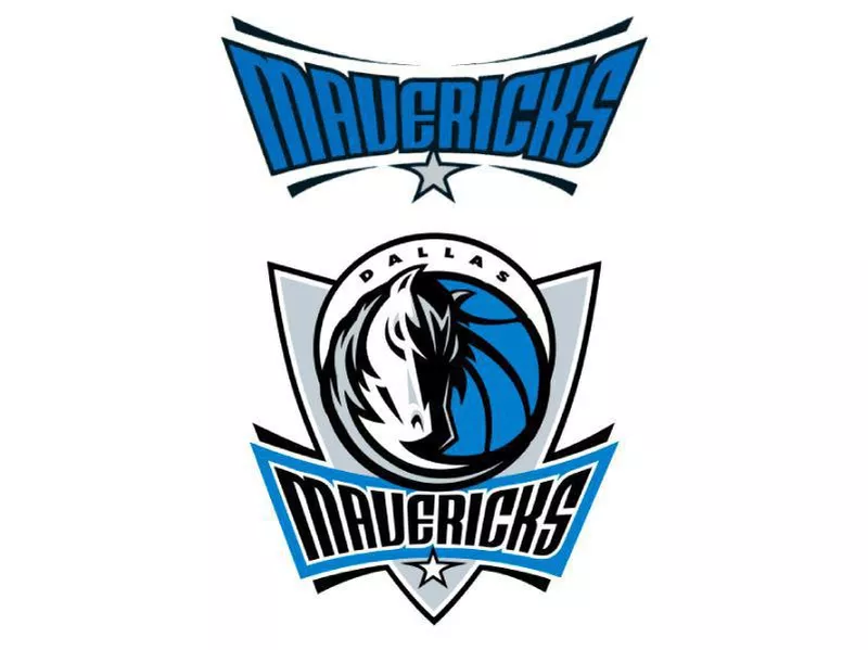
NBA
The inaugural Mavericks logo in 1980 featured a light green basketball with a blue M, and on the top right of it was a cowboy hat. The wordmark “DALLAS MAVERICKS” appeared in blue with a green outline.
In 1994, the original Mavericks logo underwent a slight update as “DALLAS MAVERICKS” appeared in solid blue with no green outline.
In 2002, the team shifted to a different logo, incorporating a shield concept with the head of a stallion and the mane sweeping outward over a basketball. The wordmark “Mavericks” appears on the bottom of the logo with a white star below it. The wordmark “DALLAS” in black appears above the stallion and at the top of the logo in smaller letters.
The current Mavericks logo underwent slight color iterations as the shield is a darker gray and the shade of blue next to the stallion appears darker.
Denver Nuggets
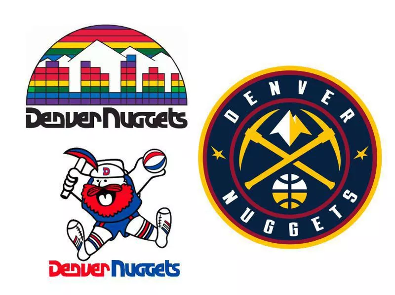
First, the Denver Nuggets were the “Denver Rockets” in 1967. The logo was a red basketball with the wordmark “ROCKETS” in black lettering encased in a black rectangle. A white ring around the basketball made up the “DENVER” wordmark, along with “RINGSBY SYSTEM” at the bottom in black. It was a design by the then-owner, Bill Ringsby.
In 1971, the team transformed the logo into a purple and yellow rocket dribbling a basketball across the Rocky Mountains with a purple circle, and in it was the “DENVER ROCKETS” wordmark in purple.
The first Denver Nuggets logo in 1974 featured a miner with a red beard and an axe in his right hand and basketball in his left with his legs spread apart. “Denver Nuggets” was curved around the miner in blue with a circle around the miner and team name.
In 1976, a slight change was made to the logo with the circle gone and “Denver” being in red and “Nuggets” being in blue with a unique font.
In 1981, the team changed its logo to a rainbow colored semi-circle with the cities being in rainbow colors, but the Rocky Mountains being white. The wordmark had a similar font, but it was in black.
From 1993 to 2003, the team transformed the logo with a dark blue mountain peak appearing at the top of the logo and a ribbon saying “Denver” stretched across the mountain. In dark gold, “Nuggets” appeared at the bottom of the mountain and “Denver” wordmark.
In 2003, the team had a few color iterations to the logo making the peak a lighter blue and the ribbon with “Denver” a light blue and yellow for “Nuggets.”
The logo in 2008 had another color change with the mountain being a darker navy blue.
The current Nuggets logo unveiled in 2018 features two gold pickaxes crossing each other with a mountain peak at the top of where the points of the axes meet. A half-white and half-yellow basketball appears at the bottom. The logo is enclosed with a red circle and outside of that are “Denver Nuggets” in white arched around it. There is a yellow and red trim around the logo and two uniquely shaped stars on each side of the logo.
Detroit Pistons
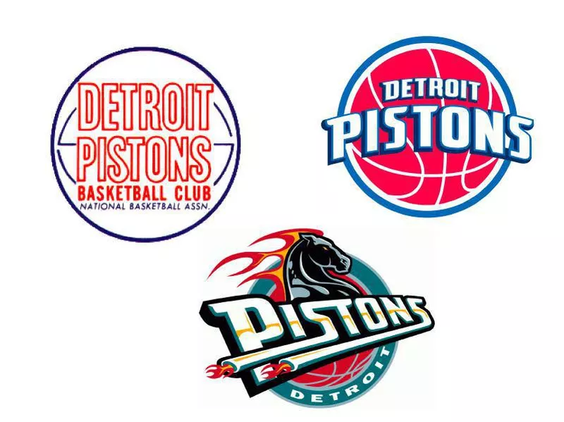
The Detroit Pistons were not always the Detroit Pistons. They were once the Ft. Wayne Zollner Pistons, in which the first logo was an animated character, who appears to be made out of red cans going in for a layup. The new design of the logo featured a gray can man with a “Z” on his chest dribbling a basketball.
The first Detroit Pistons logo in 1957 was “Detroit Pistons” outlined in orange and “Basketball Club” in solid orange below with “National Basketball Assn” in blue. The whole logo is encircled in blue.
The only change in 1971 was the removal of “National Basketball Assn.”
In 1975, “Detroit Pistons” appears in solid orange with “NBA” also in orange beneath it, while the outline of the basketball is in solid blue.
From 1979 to 1996, the design of the logo was transformed to a red and white logo with “Detroit Pistons” appearing in the center of a basketball outline. The red basketball outline is encircled by a blue ring.
In 1996, the team revamped its logo, adding a horse’s head with a flaming mane and “Pistons” running across it. Both of the “s” letters act as tailpipes to stay with the “Motor City” theme. A red basketball is behind the horse and enclosed is a teal ring with “Detroit” in white at the bottom.
In 2001, the Pistons changed the colors of the 1996 logo to red and navy blue.
In 2005, the Pistons changed their logo to a red basketball with white outlines and “Detroit Pistons” in white with a blue outline. The whole logo is enclosed with white and blue rings.
In 2017, they changed to their current logo, which is similar to the logo used from 1979 to 1996, but now it has a darker red, blue and new font for the wordmark. There is also a gray ring around the blue ring.
Golden State Warriors
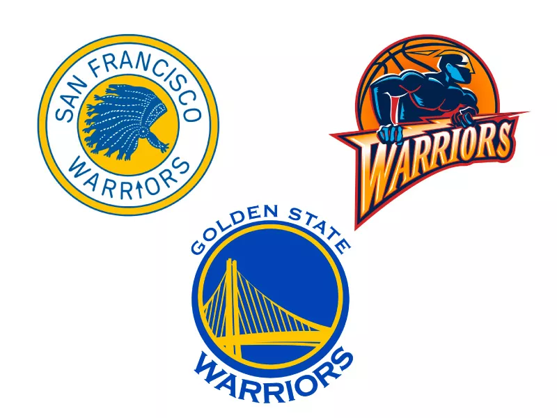
The original Philadelphia Warriors logo in 1946 was derived from a native American dribbling a basketball with “Warriors” in yellow cursive font. The next design of the Philadelphia Warriors logo has the “Warriors” wordmark in blue with “Philadelphia” on the “W.”
When the Warriors moved to San Francisco and changed their name to the “San Francisco Warriors” in 1962, the logo featured a blue and white Indian headdress inside of a yellow circle with a blue trim. “SAN FRANCISCO WARRIORS” is in blue with the “I” in “Warriors” as an arrow. The background on the wordmark is white while a blue trim and yellow ring enclose it.
The last San Francisco Warriors logo, from 1969 to 1971, was a blue bridge signifying the Golden Gate Bridge and a yellow background encircled with a blue ring. “The City” in blue is at the top of the logo.
In 1971, the first Golden State Warriors logo is an outline of California in blue and a blue star located on the Bay Area with yellow serving as the California color and the logo color. The number 14 in blue is to the right of the outline of California. A wordmark “Golden State Warriors” is arched from top to bottom in blue.
The next logo iteration in 1972 is similar to the previous one, but the wordmark “Warriors” and “Basketball” in blue appear at the top and bottom, respectively.
From 1975 to 1988, the team goes back to the 1972 logo, but adds lines to form a basketball on the yellow circle and removes the “14” on it.
The next team logo in 1988 features a rounder and more gold basketball with the wordmark “GOLDEN STATE WARRIORS” appearing in blue bold font stretched around the basketball.
The team revamped its logo in 1997 with a masked blue man (the Warriors’ mascot, Thunder) holding a lightning bolt that is attached to the “W” in “Warriors.” Behind him is a basketball with many borders and outlines.
The current Warriors logo, released in 2010, features the new Bay Bridge in yellow on a blue background with yellow and blue rings around it. The wordmark “Golden State Warriors” is arched on top and bottom of the logo.
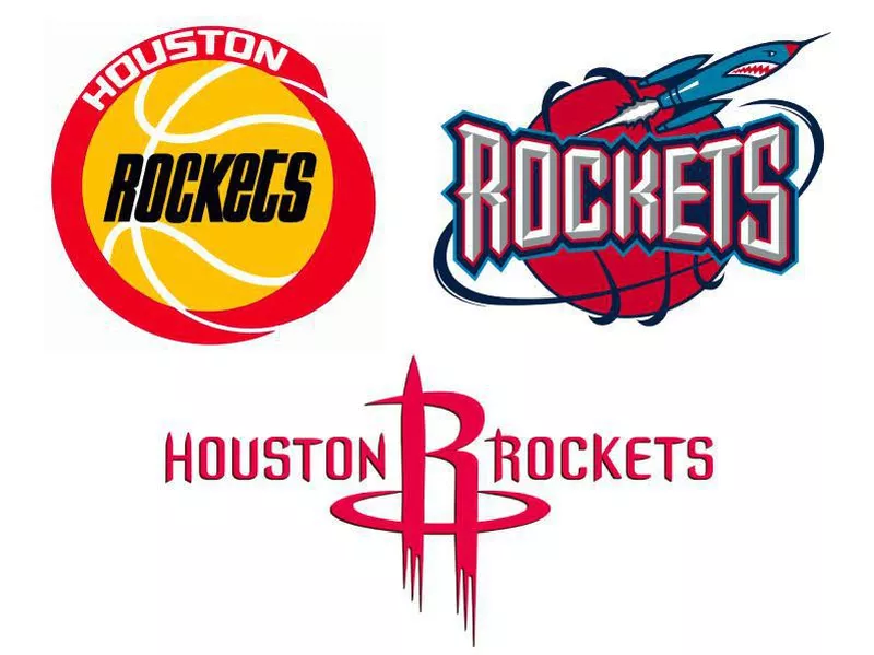
Houston Rockets
The first and final San Diego Rockets logo (1967-1971) was a blue rocket blasting through a light orange basketball with white outlines and a green ring with “San Diego Rockets” on it.
The first Houston Rockets logo in 1971 featured a player in a red jersey with a yellow “H” and a rocket jetpack spewing out red and yellow fire. At the end of the fuel was the wordmark “HOUSTON ROCKETS.” The player has a yellow spinning “NBA” ball from his finger.
The next Rockets logo in 1972 features a light orange basketball with white lines and the black font of “ROCKETS” on it surrounded by a thick red ring and “Houston” in white on top of the red ring.
In 1995, the team chose to drastically change its logo. It featured a new color scheme with a red basketball and on top of the basketball was the gray wordmark “ROCKETS” with a rocket ship flying around the basketball.
The current Rockets logo, unveiled in 2003, has a dominant red color scheme with “HOUSTON ROCKETS” in red and an “R” that takes off like a rocket with two boosters. The “R” is in the middle of the wordmark.
Indiana Pacers
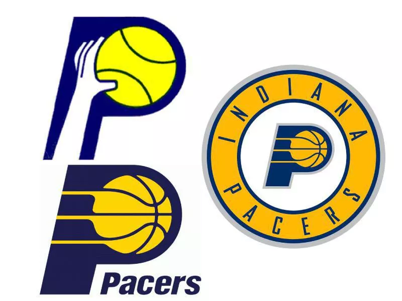
The inaugural Pacers logo in 1967 is a white hand grabbing a yellow basketball inside a blue “P.”
The next logo in 1976 has a slight color change with the basketball looking more gold and the “P” being a lighter blue. There is also a wordmark of “Indiana Pacers” to the right of the “P.”
In 1990, the logo changed to a more navy blue “P,” and the basketball had more lines with yellow streaks coming off the ball. Also, in navy blue is the wordmark “Pacers.”
In 2005, the Pacers logo underwent slight alterations with a gray outline around the “P” and the basketball appearing more gold than yellow.
The current Pacers logo, updated in 2017, features the “P” from the 2005-2017 logo in the middle of a gold ring with a white background. The wordmark “Indiana Pacers” is stretched around the gold ring.
Los Angeles Clippers
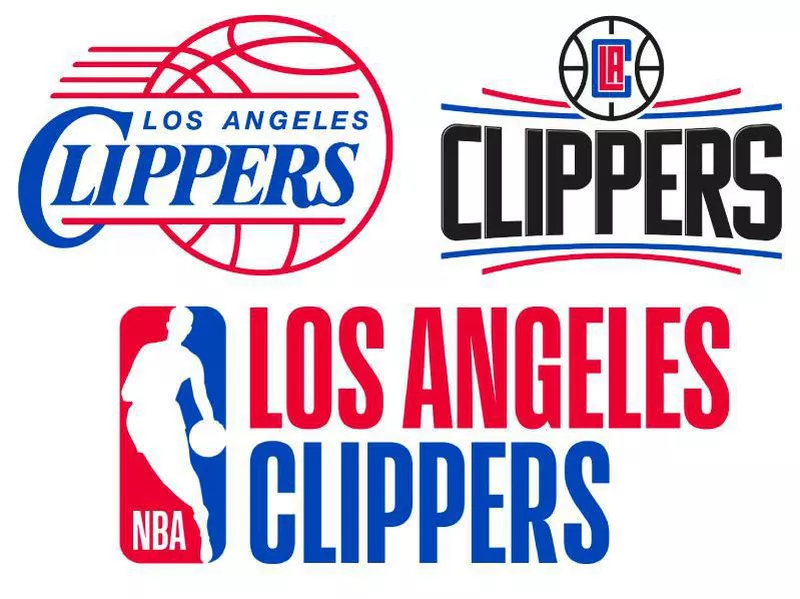
The Los Angeles Clippers were once the Buffalo Braves. In 1970, they introduced their first Braves logo featuring a yellow basketball with red feathers on top and inside of the basketball was a blue buffalo. Under the basketball was the wordmark “Buffalo Braves.”
From 1971 to 1978, the Braves used a logo with a light blue “B” and attached to the end of it was a red feather. Underneath in red was “Buffalo Braves.”
The team moved to San Diego in 1978, prompting a new logo, which featured three white masts with a red sun on the farthest one, and it was enclosed in a blue circular background. The wordmark “San Diego” appeared in blue and “Clippers” appeared in red at the bottom of the logo.
The next San Diego Clippers logo was a breezy “SAN DIEGO CLIPPERS” light blue logo with a red-outlined basketball as a background.
The Clippers in 1984 moved to Los Angeles and led to a slight alteration to the logo, changing the wordmark “San Diego” to “Los Angeles.” Additionally, the red-seamed basketball and blue lettering are darker.
In 2010, the team changed boldness of the red and blue, making both darker, but still keeping the same logo as before.
The current Clipper logo, released in 2015, has a white basketball with “LAC” in it, with “LA being red and the “C” being wrapped around the “LA,” essentially embracing the city of Los Angeles. There are red and blue curved lines on top and bottom of a black and bold “CLIPPERS” wordmark.
Los Angeles Lakers
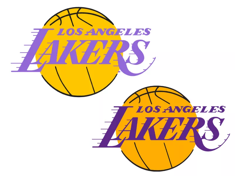
The Los Angeles Lakers were once the Minneapolis Lakers. They were named the “Lakers” in 1947 because of the 10,000 lakes Minnesota had.
The first Lakers logo featured the state of Minnesota in white with a gold star on Minneapolis. The state is on a gold basketball, and the wordmark says “MLPS” (the city’s abbreviation) with “LAKERS” at the top and bottom, respectively. There are two stars on the left and right of “MLPS.”
The team moved to Los Angeles in 1960, and the inaugural Los Angeles Lakers logo featured a gold basketball with “LAKERS” in purple with streaking lines and “LOS ANGELES” appears on top.
In 1976, the logo has some slight alterations with the ball being more yellow and rotated with the wordmark being light purple.
The current Lakers logo, released in 2001, has some slight color iterations with the ball becoming more gold, the purple being darker, and the outline of the basketball in black being darker as well.
Memphis Grizzlies
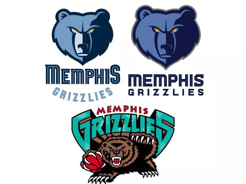
The Memphis Grizzlies were the Vancouver Grizzlies from 1995 to 2001, with a menacing grizzly bear holding a red basketball in its right claw. Above the bear is “GRIZZLIES” in teal with “Vancouver” on top in red.
The team moved from Vancouver to Memphis in 2001, and the first Memphis Grizzlies logo is just like the Vancouver Grizzlies logo except it says “Memphis” instead of “Vancouver” on top of “GRIZZLIES.”
The logo in 2004 features a blue grizzly bear with different accents of blue on its face. A darker shade of blue appears on the right side of its face, with the eyes being yellow. The wordmark “MEMPHIS” appears in two shades of blue and on top of “GRIZZLIES,” which is a lighter blue tone.
The current Grizzlies logo, updated for the 2018 season, shows a larger version of the grizzly bear, outlined in gray, with “MEMPHIS” having two darker tones of blue and “GRIZZLIES” being straight under “MEMPHIS” and in a darker blue, instead of being curved like the previous logo.
Miami Heat
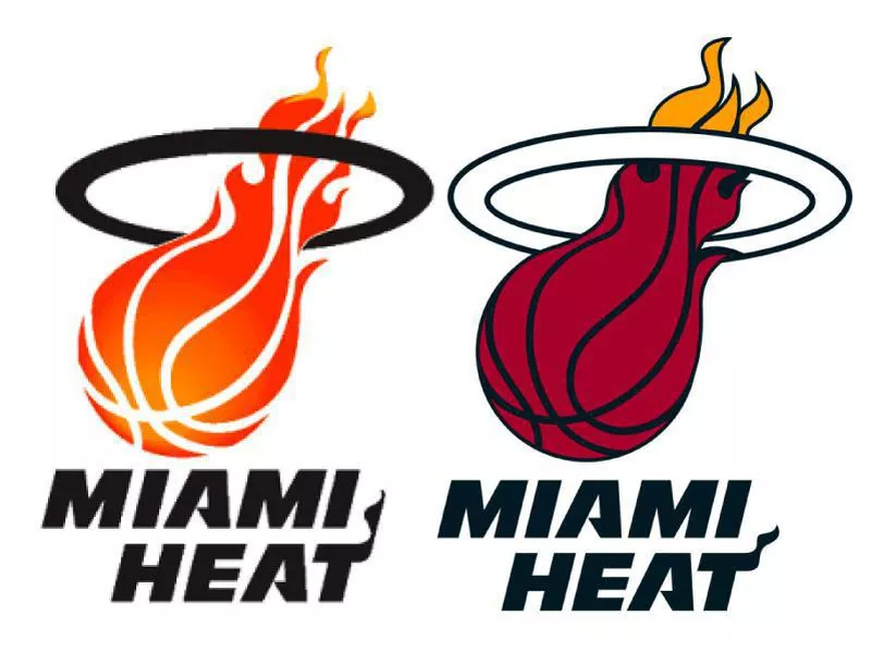
The first Miami Heat logo in 1988 has a flaming basketball going through a black hoop with the wordmark “MIAMI HEAT” appearing at the bottom and the “T” having a small flame attached to it.
The current logo was updated in 1999 from the original concept. The flaming basketball is red with the end of the flame being orange and going through a white hoop. The wordmark is the same and slightly darker.
Milwaukee Bucks
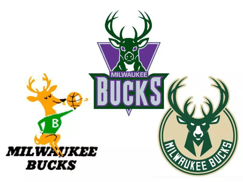
The Milwaukee Bucks have had four logos since they were founded in 1968.
Their first logo had an animated buck in a green sweater with a white “B” holding a spinning gold basketball in his hand, while sitting on a black wordmark “MILWAUKEE BUCKS.”
A new, revamped logo was unveiled in 1993 and shows a menacing-looking buck in green with purple eyes. Behind it is a purple triangle background. In front of the buck is “MILWAUKEE” in silver on the triangle, and “BUCKS” is in silver on a green background.
In 2006, some slight changes were made to the Bucks logo. The triangle background became red, and the “BUCKS” typography was sharper.
The current logo, from 2015, features a more intimidating-looking buck in green with the eyes, ears and nasal structure being white. The chest of the buck resembles an “M,” which is short for Milwaukee. The white wordmark is inside the logo with a sturdy font, and it is curved around the chest of the buck.
Minnesota Timberwolves
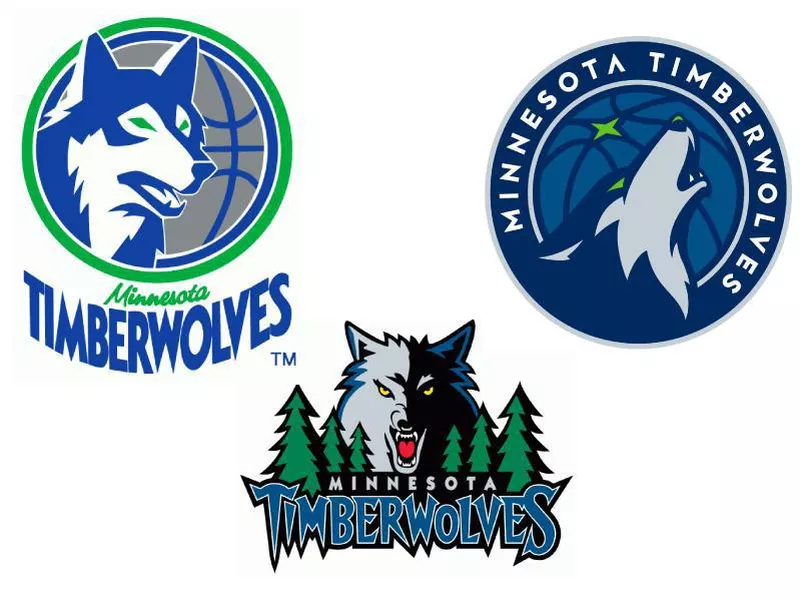
The first Minnesota Timberwolves logo in 1989 is an aggressive-looking wolf in blue and white, inside a green ring on top of a gray basketball with a blue outline. “MINNESOTA” appears small and in cursive in light green at the bottom of the logo and “TIMBERWOLVES” is larger in blue beneath the “MINNESOTA” wordmark.
In 1996, the team revamped its logo with a half-silver, half-black menacing-looking wolf with trees on both sides of it. A large and jagged “TIMBERWOLVES” appears at the bottom with “MINNESOTA” appearing on top of the “TIMBERWOLVES” lettering.
The team made some changes to the logo in 2008, adding white to the wolf’s face, a lighter green on the trees and “TIMBERWOLVES” with a more normal font in white.
The current logo, unveiled in 2017, is new and improved. It features a blended navy blue and gray wolf howling with a lighter shade of blue basketball and a green star in the background. There is a gray circle around the basketball and “MINNESOTA TIMBERWOLVES” is stretched around the gray outline in white font with another gray ring completing the logo.
New Orleans Pelicans
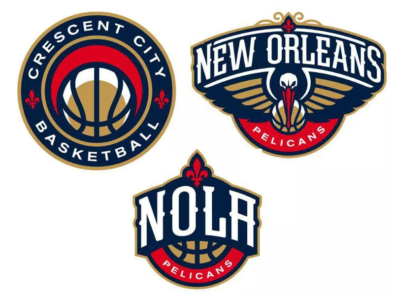
The New Orleans Pelicans were born in 2002 after then-Charlotte Hornets owner George Shinn moved the franchise to New Orleans and changed the name of the team to New Orleans Hornets. T
he relocation led to some updates with the logo, including “NEW ORLEANS” being at the top of the logo with the hornet dribbling a lighter yellow-colored basketball. Also, the eyes of the hornet and the stripes on the stinger are a darker blue. “New Orleans” is stretched across the hornet in white and a yellow “H” is in between “New Orleans.”
The team changed its name to Pelicans in 2013 and released a new logo — the current logo — featuring a navy-blue pelican with gold wings holding a gold basketball in its red beak. The wordmark “PELICANS” is underneath it in white on a red background, and “NEW ORLEANS” is at the top of the logo in white. There is a red fleur de lis at the top of the logo.
They are called the Pelicans because, according to owner Tom Benson, they are “a symbol for our city and region.”
New York Knickerbockers
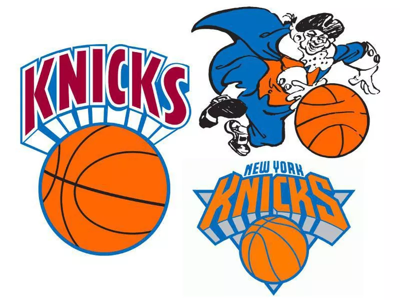
The Knicks were founded in 1946, and their original Knickerbockers logo is of a guy named “Father Knickerbocker” in blue, orange, and white, dribbling a basketball.
The next logo of the Knickerbockers in 1964 is of a block-wordmark “KNICKS” in dark orange with a faded brown basketball underneath.
In 1979, the team made some slight alterations to the logo, puting “KNICKS” in red on a white background with blue trim. Also, the basketball is orange with black seams.
In 1983, the basketball became dark brown with even darker brown seams, and “KNICKS” is in orange instead of red.
In the next logo in 1989, “KNICKS” has a darker orange, and the basketball matches that color with the seams being blue, matching the outline of the wordmark. I
In 1992, the logo was changed with the classic “roundball logo” having a gray triangular background and “KNICKS” getting a futuristic type.
There was one slight change to the logo in 1995 when the team added “NEW YORK” in blue at the top of “KNICKS.”
The current logo was updated in 2011 and include some small alterations from the previous logo version. The black shadow of the “KNICKS” wordmark was removed, opting for gray instead, and the blue got darker, while the orange got a bit lighter.
Oklahoma City Thunder
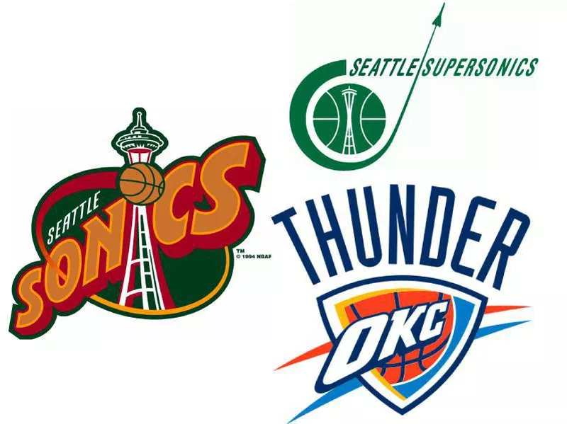
The Oklahoma City Thunder used to be the Seattle SuperSonics. The franchise moved from Seattle in 2008, ridding itself of the “Sonics” name and opting for “Thunder.”
The inaugural Seattle SuperSonics logo in 1967 is the Space Needle inside a green basketball with the Sonic shuttle flying past the basketball and “SEATTLE SUPERSONICS” in green.
The second SuperSonics logo in 1970 featured a green basketball with “SEATTLE SUPERSONICS” in the middle of the ball in white.
The next logo, used from 1971 to 1975 is in all green again, with a basketball off to the right and “SONICS” in big lettering shaped like a spaceship and “Seattle” and “Super are on top of the first “S.”
The next Sonics logo, used from 1975 to 1995, features a yellow basketball with the Seattle cityscape in green and below it is “SEATTLE SUPERSONICS” in green as well.
The next logo in 1995 is a bold orange font spelling out “SONICS” with the “I” being the Space Needle and a basketball on the landmark. “SEATTLE” is in white above “SONICS.” It is on a green background with a red and yellow ring.
The last Sonics logo, released in 2001 and used until the end of the franchise in 2008, is a white “S” representing Sonics on top of a yellow basketball. The logo is on a green background that looks almost like a backboard on a basketball hoop. “SONICS” is in yellow with a green trim throughout it, and “SEATTLE” is in white above Sonics.
The only Oklahoma City Thunder logo has a shield-like feel to it with “OKC” spread across it in white with a basketball behind it. There is an orange and a blue streak behind the logo. Additionally, “THUNDER” is in navy blue at the top of the logo.
Orlando Magic
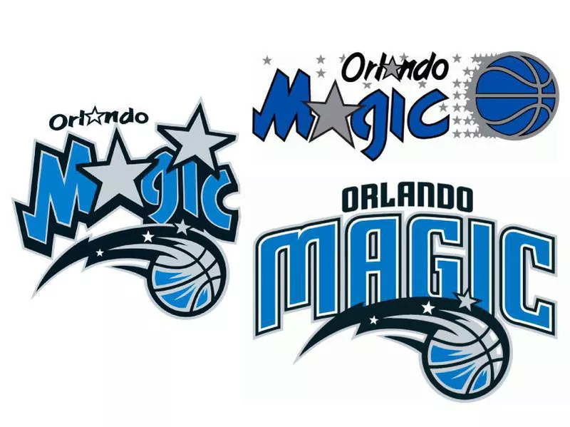
The first Orlando Magic logo in 1989 spells “Magic” in blue with a silver star in place of the “A,” and “Orlando” is to the right of it with a silver star also in place of the “A.” Additionally, there is a blue basketball and several silver stars trailing it, creating the appearance of a shooting star.
The next Magic logo from 2000 to 2010 is a smaller “Orlando” with the same star in place of the “A” and “Magic” enlarged with the “A” and “I” replaced as silver stars. A blue and silver basketball with black streaks and silver stars is at the bottom of the logo.
The current logo, unveiled in 2010, goes away from the “Magic” with the stars replacing the “A” and “I” and instead has a unique blue font of “Magic.” On top of “Magic” is “Orlando” in black with the same shooting-star basketball used in the 2001 logo design, but smaller.
Philadelphia 76ers
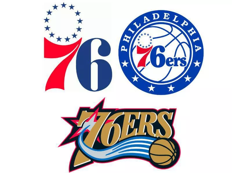
The 76ers were once the Syracuse Nationals, and their first logo, unveiled in 1946, was a light blue map of the United States with the wordmark “Nationals” in cursive white writing. Red and white stripes that make out a circle are a background to the map, and blue and red stars surround the logo.
An updated version of the logo followed with the United States map being white with “SYRACUSE Nationals” in a dark blue font inside it and blue stars surrounding the logo.
The Nationals moved to Philadelphia in 1963, and the team became the 76ers. The first 76ers logo featured a circle of blue stars with “76” enlarged with the “7” being red and the “6” being blue.
From 1977 to 1997, the logo had the previous logo, but it was smaller and inside a white basketball with blue seams.
In 1997, the 76ers revamped their logo completely with “76ERS” in gold and red and black trim. A gray star is enclosed around the “7,” which shoots out a shooting-star gold basketball.
The logo from 2009 to 2014 is the 1978 logo inside a red box with gray trim, and at the bottom is a blue rectangle with “PHILADELPHIA” in white.
The current logo, updated, in 2015, is the 1978 logo with a blue ring that says “PHILADELPHIA” in white on top, and it has five white stars spread out curved along the bottom of the logo.
Phoenix Suns
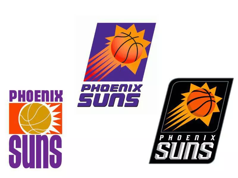
The first Phoenix Suns logo from 1968 has a blazing light orange basketball with flames coming off it and an orange rectangular background behind it. “Phoenix” is at the top of the logo in purple, and “Suns” is at the bottom, also in purple.
From 1992 to 2000, the team made drastic changes to its logo with an orange basketball as the sun shooting into the sky on a purple background. “PHOENIX SUNS” is at the bottom of the logo in purple.
The next logo in 2000 has some slight alterations. The basketball looks more animated with the sun as a more yellow color and the purple background being surrounded by a gray trim. “PHOENIX SUNS” is in white at the bottom of the gray trim.
The current Suns logo, released in 2013, shows the basketball sun shooting star, but with a black background, and the silver font of “PHOENIX SUNS” is more futuristic and modern.
Portland Trail Blazers
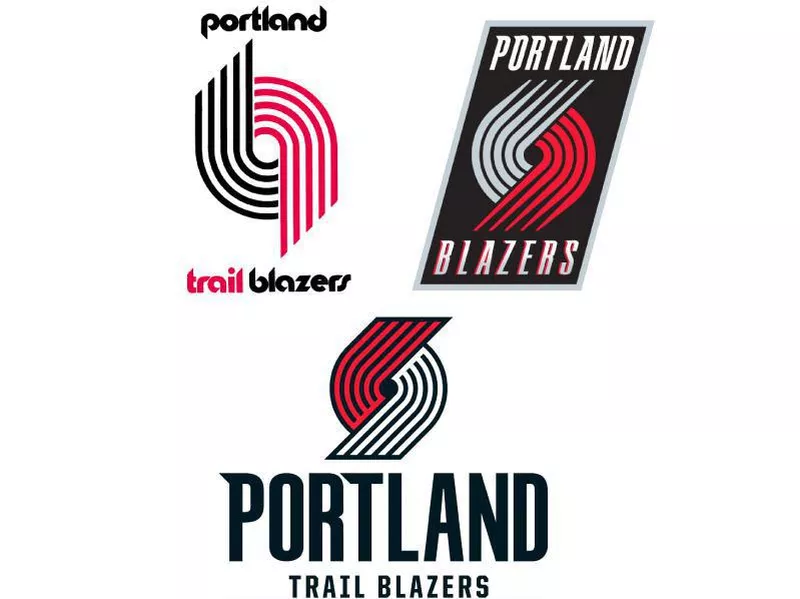
The first Portland Trail Blazers logo from 1970 is a trailblazing track with the top being black and the bottom being red. “Portland” is in black font and “trail” in red with “blazers” being black.
The next logo in 1990 is the trailblazing track, but smaller, and the colors switched on top and bottom. “BLAZERS” is to the right of the icon with black font and red trim.
The 2002 Blazers logo is the blazer track with two changes. The top of the track is white, instead of gray, and the center is black. Also, “BLAZERS” is spelled with a futuristic edge to it.
The next logo in 2003 has a slight change with “BLAZERS” being in white and “PORTLAND” at the top of the logo. It is on a black background and a gray trim around it.
The only change on the next logo in 2004 is “TRAIL” is just above “BLAZERS” at the bottom of the logo.
The current Blazers logo, released in 2017, is an animated trail logo with the red on top and white at the bottom. “PORTLAND” is in black and enlarged with a futuristic edgy font. “TRAIL BLAZERS” appears beneath the “PORTLAND” wordmark in black.
Sacramento Kings
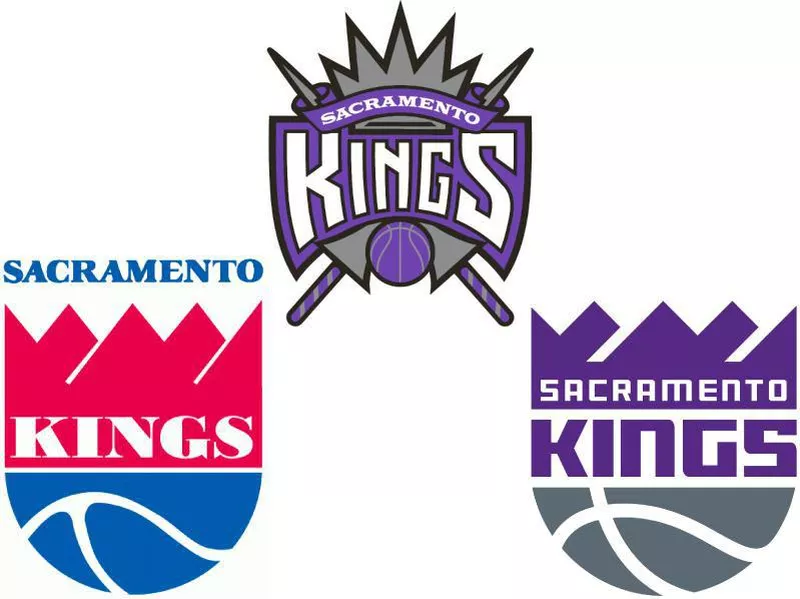
The Sacramento Kings were once the Rochester Royals. The first Royals logo in 1945 featured a blue shield with blue and white trim, “ROCHESTER” in white and a white banner spelling out “ROYALS” in blue.
The team moved to Cincinnati in 1957, and its new logo featured an animated smiling white basketball looking up at his crown, which had the city of Cincinnati on top of it and “Cincinnati Royals” in blue. In white block font, “CINCINNATI” was at the top of the basketball face and “ROYALS” appeared at the bottom in white.
The final Cincinnati logo in 1971 featured a red crown in the shape of a cityscape with “ROYALS” at the bottom of the crown in white, and half of a blue basketball with white seams appeared at the bottom. Also, “CINCINNATI” appeared at the top of the crown in blue.
The team then moved to Kansas City-Omaha in 1972, and staying with the final Cincinnati logo, it put “KANSAS CITY-OMAHA” at the bottom of the logo curved around and “KINGS” at the base of the crown in white. Then, the logo changed in 1975 with the half-basketball becoming a lighter blue and “KANSAS CITY” appearing at the top of the crown in light blue.
The first Sacramento Kings logo in 1985 is a slightly altered Kansas City Kings logo with the red on the crown more faded and “SACRAMENTO” replacing “KANSAS CITY.”
In 1994, the Kings changed their logo drastically, going with a color scheme of purple, gray and white. The logo is a gray crown with purple and gray lancers crossing. A wordmark, “SACRAMENTO,” appears in white on a purple stripe, and “KINGS” is enlarged and below the top wordmark. Also, beneath “KINGS” is a purple basketball.
The current Kings logo, unveiled in 2016, is a play on the final Kansas City logo, but in purple and gray. The cityscape crown is purple with “SACRAMENTO” in white. Below that is “KINGS” in bold purple and the half-basketball in gray with white seams.
San Antonio Spurs
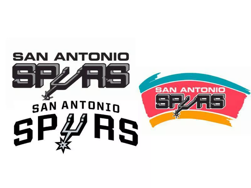
The Spurs were once the Dallas Chaparrals. Their first logo in 1967 was a blue bird dribbling an ABA basketball.
The Dallas Chaparrals became the Texas Chaparrals in 1970 and changed their logo. Now, the the bird dribbling the basketball was inside the state of Texas in gray with a black outline. The wordmark “CHAPARRALS” appears in red below the bird.
The first San Antonio Spurs logo in 1976 featured “SPURS” in black block type with the “U” looking like a spur and “SAN ANTONIO” above the Spurs wordmark.
The next Spurs logo from 1989 to 2002 had “SPURS” in black block text with the “U” being a spur just like the previous logo. “SAN ANTONIO,” however, was in white font, and the logo was on a pink streak with a teal streak on top and yellow streak at the bottom.
The next logo in 2002 has “SPURS” in a black font with the “U” replaced by a spur and “SAN ANTONIO” on top in white on a black strip.
The current logo, released in 2017, has “SAN ANTONIO” in bold with “SPURS” enlarged and in a more futuristic and clean font, and the “U” is replaced by a spur.
Toronto Raptorsa
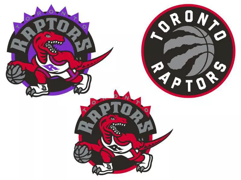
The first Raptors logo from 1995 to 2008 featured a red raptor dribbling a silver basketball with a jersey that has an “R” on it. A black semi-circle is behind the raptor with “RAPTORS” in silver curved at the top of the black semi-circle. There is also purple behind the black semi-circle, and on top of it is the wordmark “TORONTO.”
The next Raptors logo in 2008 has some slight adjustments, changing the purple to red.
The current logo, released in 2015, is a silver basketball that has three shreds in them like it was ripped by a raptor. It is encircled by a black ring with “TORONTO” in white on top and “RAPTORS” in white at the bottom. Red trim surrounds the black ring.
Utah Jazz
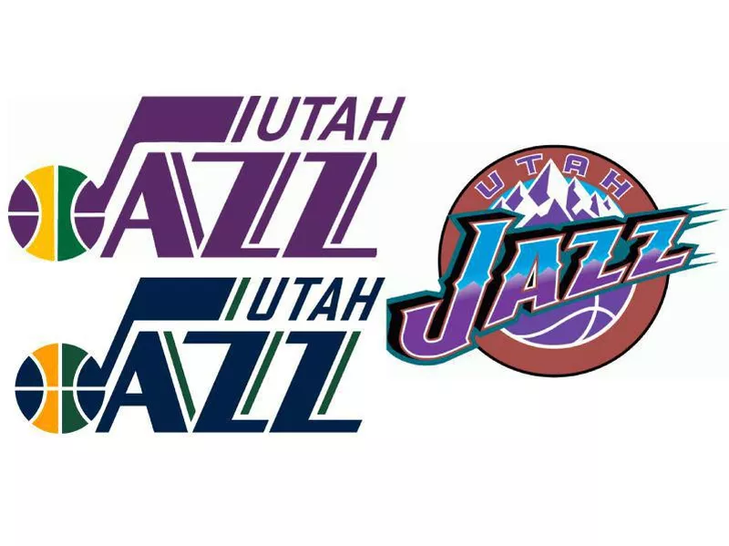
The Utah Jazz started as the New Orleans Jazz from 1974 to 1979. The New Orleans logo featured a purple “JAZZ” wordmark with the “J” being a jazz note, and at the end of the “J” was a purple, yellow and green colored basketball. “New Orleans” appeared on top of the “JAZZ” wordmark in bold above of both Z’s.
The first Utah Jazz logo in 1979 featured the same “JAZZ” logo, but “UTAH” in purple above both Z’s.
The next Jazz logo in 1996 was a dramatic alteration. The word “JAZZ” no longer featured the jazz note on the “J,” with the top half of each letter being light blue and the bottom half being purple. Behind that are the snowy Salt Lake City mountains, and under “JAZZ” is a semi-basketball in purple. It is surrounded by a copper ring with “UTAH” in purple inside of the ring at the top.
From 2004 to 2010, the only changes to the logo were color alterations, which made “JAZZ” all in light blue with the ring around the mountains and basketball a navy-blue color. “UTAH” is in gray inside of the ring at the top.
The changes to the next logo in 2010 are minor. The team got rid of the light blue and instead have “JAZZ” in white with a yellow trim. The mountains and basketball are dark green with “UTAH” being white inside of the ring at the top.
The current logo, released in 2016, pays homage to the first Utah Jazz logo with the “J” jazz note in navy, yellow and green,. The rest of the “JAZZ” word is navy blue and so is “UTAH.”. There are green accent lines on the outside of the “JAZZ” insignia.
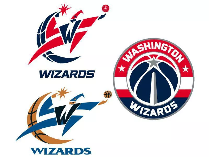
Washington Wizards
The Washington Wizards franchise started as the Chicago Packers in 1961 with a bull image inside a brown basketball as their logo.
The team changed its name to Chicago Zephyrs in 1962 and spelled out “Zephyrs” in gold with a light-blue trim as its logo.
In 1963, the franchise relocated to Baltimore and became the Baltimore Bullets. Their first logo featured “Bullets” in orange with a blue bullet whizzing by the wordmark. There is a white basketball with blue seams, and “BALTIMORE” is off to the right on the basketball.
The next Baltimore Bullets logo in 1968 is “bullets” spelled out in orange with the “Ls” acting as arms reaching up for a orange basketball above. A small “BALTIMORE” appears in blue on top of the “b” and “u” in “bullets.”
In 1969, the team made slight changes to the logo with “bullets” matching the lighter blue of “BALTIMORE” and the basketball being a lighter orange.
In 1971, the colors changed again with both “BALTIMORE and “bullets” being a more royal blue and the basketball changing to red.
In 1972, Baltimore’s final logo, the team went back to the light blue that was the color of the logo in 1969. Additionally, the orange basketball is slightly darker.
In 1973, the team became the Capital Bullets and used the same logo as the Baltimore logo in 1971, changing “BALTIMORE” to “CAPITAL.”
In 1974, the team became the Washington Bullets and used an all-blue logo with the same concept as the previous logos.
The final Washington Bullets logo in 1987 is a similar concept to the previous logo, except “Washington” is removed, there is a different font for “Bullets,” and the hands look ready to grab the basketball, which is red again with white seams.
The first Washington Wizards logo in 1997 featured a wizard in blue with a basketball at the tip of one finger and a star on the other finger of the other hand. There is also a giant “W” on his chest. A crescent moon is shaped like a basketball, and a “WIZARDS” wordmark is at the bottom in blue.
The next logo in 2007 has slight alterations as the moon crescent and the basketball are a lighter gold color.
From 2011 to 2015, the team changed its colors to red, white, and blue, and the logo had those colors. Also, “WIZARDS” has a more modern and futuristic font.
The current Wizards logo, released in 2014, has a red and white basketball with a small animated Washington monument at the bottom of it. A silver star is on top of the monument, and the white seams make up the rest of the basketball. There is a red, white, and blue ring around the basketball with “WASHINGTON” on the red part of the ring in white font and “WIZARDS” on the blue part, also in white font. There are two stars below the “WASHINGTON” wordmark that align with the silver star and that represent D.C., Maryland and Virginia.