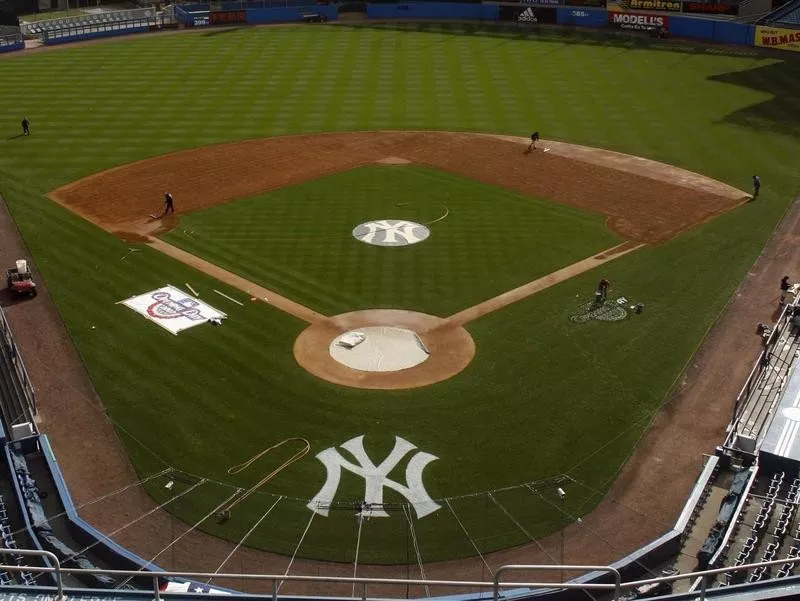
Sport: Baseball (MLB)
Established: 1901 (based in New York City since 1903)
Other names: Bronx Bombers, Yanks, Pinstripers, Bronx Zoo, Evil Empire, Murderer’s Row
Mascot: None
Championships: 27 (1923, 1927, 1928, 1932, 1936, 1937, 1938, 1939,1941,1943, 1947, 1949, 1950, 1951, 1952, 1953, 1956, 1958, 1961, 1962, 1977, 1978, 1996, 1998, 1999, 2000, 2009)